.png)
Case Study
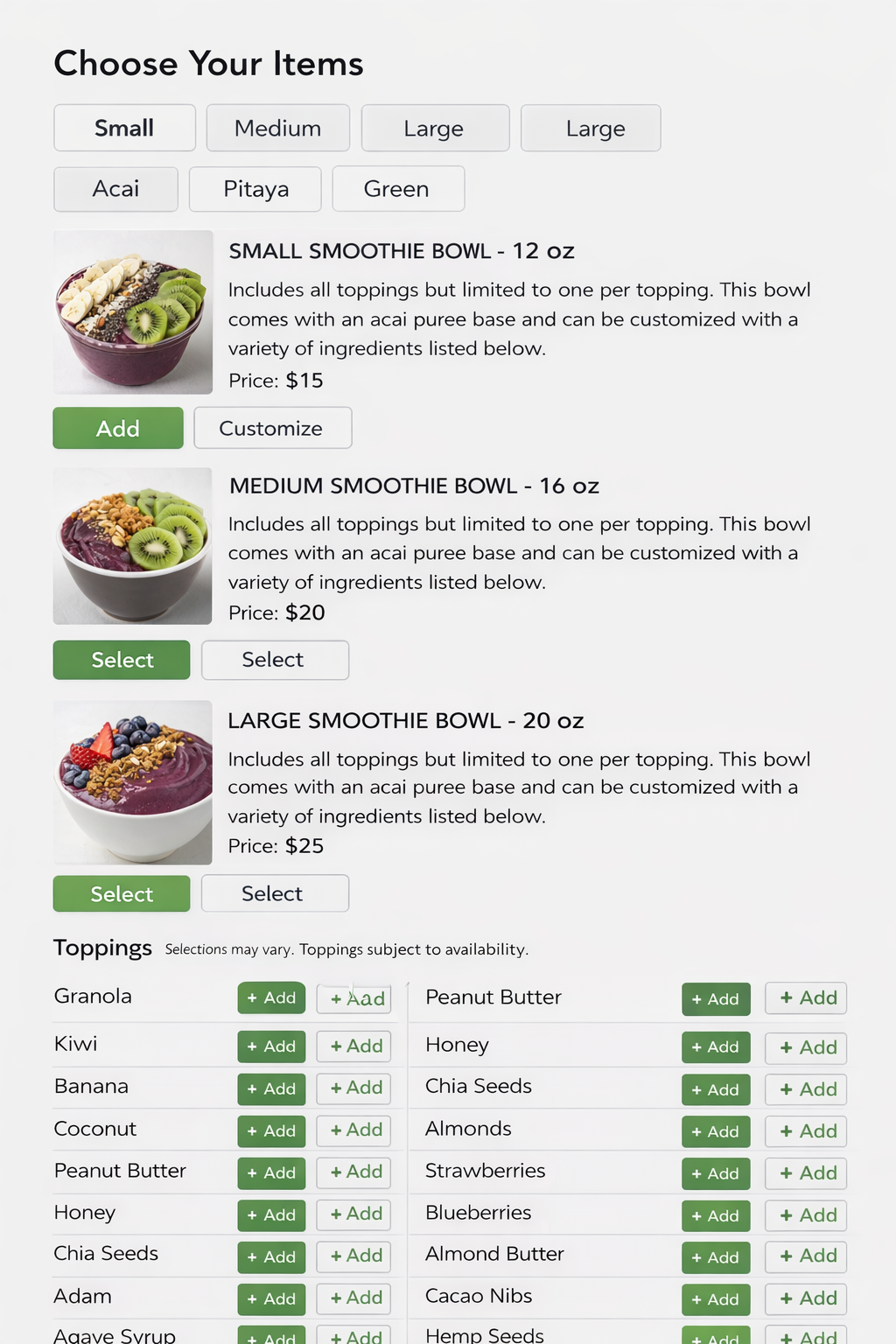
Redesigning the in-store ordering experience to reduce friction, increase throughput, and support high levels of customization without slowing users down. Data based on usability testing with 10 participants using a high-fidelity Figma prototype.
Faster checkout after introducing step-based flow
Reduction in total order time by lowering per-screen cognitive load
Fewer incorrect orders due to removal of ambiguous customization input
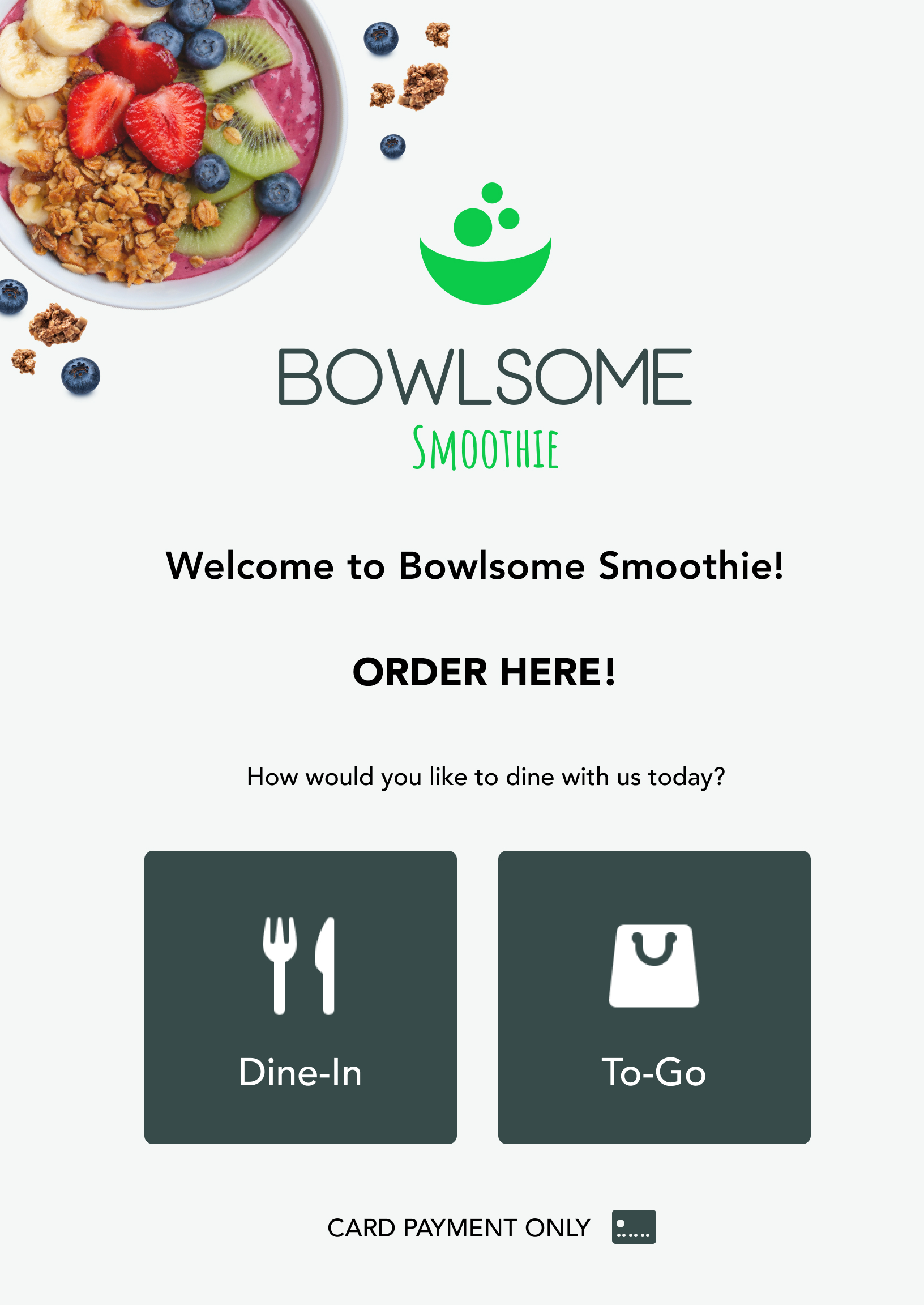
During peak hours, Bowlsome’s in-store ordering process slowed significantly due to high variability in customer customization and reliance on verbal order-taking.
Customers were required to communicate multi-step custom orders to staff, which introduced delays, inconsistent interpretations, and frequent hesitation at the point of purchase.
The kiosk experience needed to operate in a high-traffic retail environment where users typically spend only a few seconds per decision screen.
The system also had to support a fully customizable menu without increasing cognitive load as menu complexity scales.
From a product standpoint, reducing customization was not an option, meaning the design had to solve for complexity through structure rather than limitation.
Across similar self-service systems, users consistently demonstrated scanning behavior rather than full reading, especially in high-speed environments like food ordering.
When presented with too many options at once, users tended to pause longer before making decisions, increasing overall ordering time.
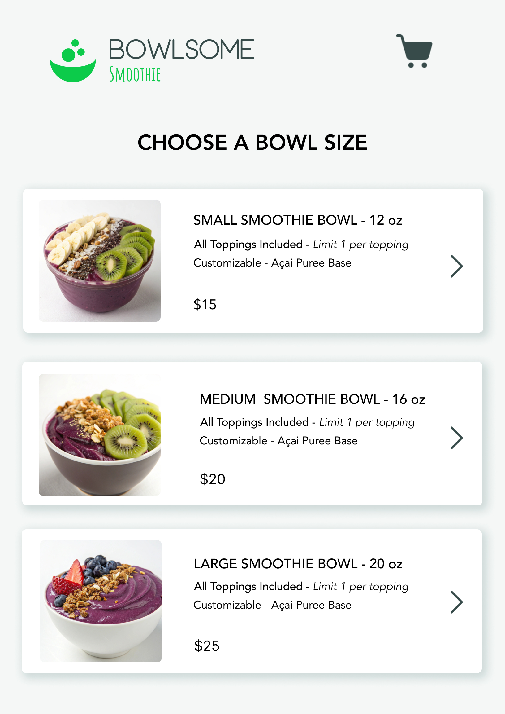
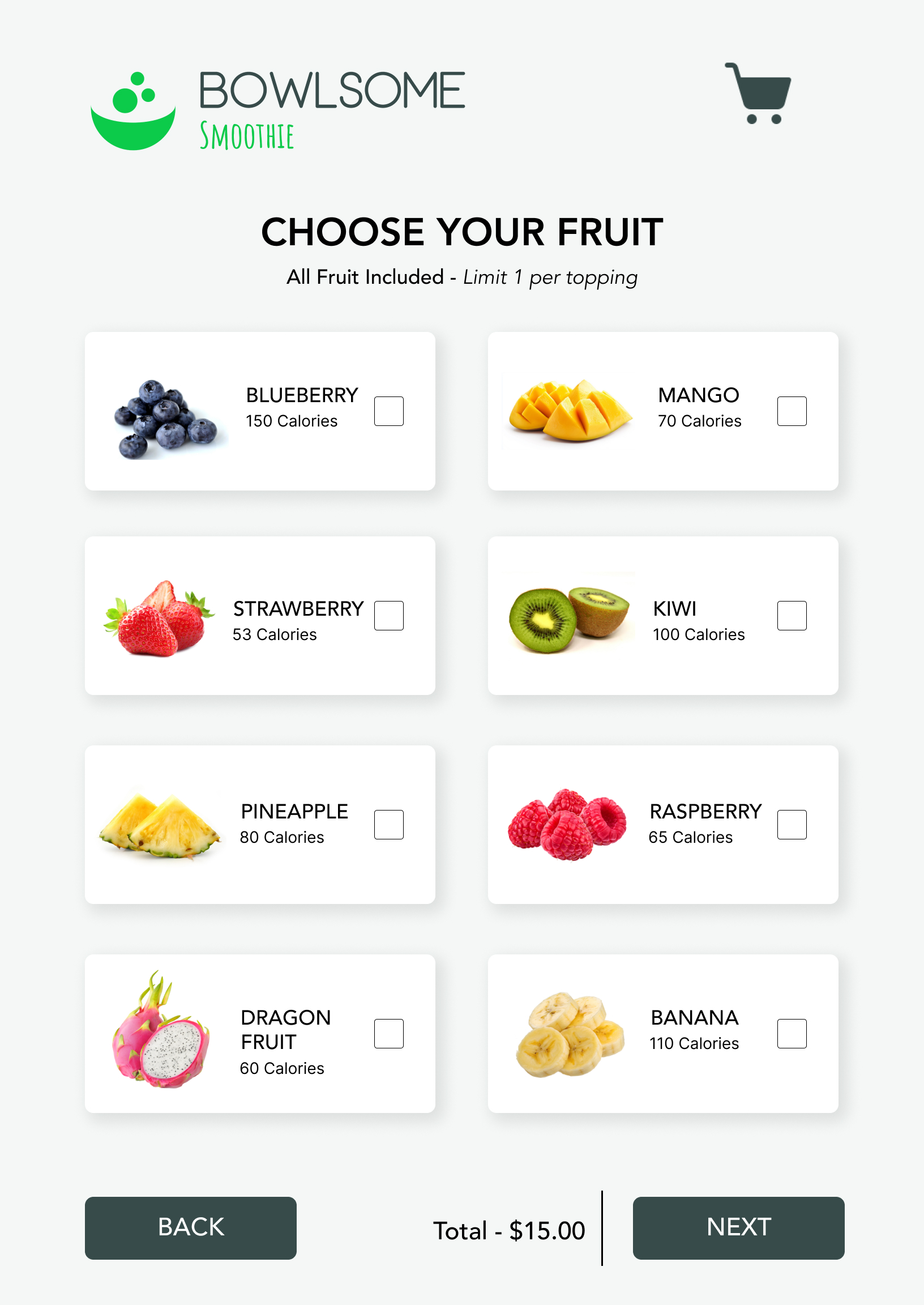
This reinforced the need for a visual-first, step-based structure that reduces decision density per screen.
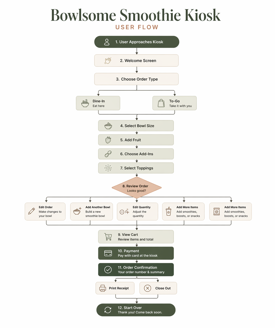
Rather than simplifying the product offering, I focused on simplifying decision-making. The experience was structured into guided steps that reduce cognitive load while maintaining flexibility.
I initially evaluated a single-page layout to minimize navigation overhead. However, presenting all customization options at once increased cognitive load and slowed decision-making.
Decision: I chose a step-based flow to reduce per-screen decision complexity, even if it introduced additional navigation steps.
Reducing menu complexity would improve speed but directly conflict with the product requirement of full customization.
Decision: I preserved full customization but structured it into progressive layers to manage complexity.
Users consistently ignored instructional content and instead relied on visual scanning patterns.
Decision: I prioritized imagery and grouping over text-heavy guidance to match real user behavior.
The redesign transforms a fragmented, staff-dependent process into a structured, self-service experience that improves speed and clarity.
The redesigned kiosk improved ordering efficiency while maintaining full customization capabilities.
Users were able to complete orders with fewer pauses between steps, indicating reduced cognitive friction across the flow.
In peak-hour conditions, the system reduced reliance on staff-assisted ordering, allowing more consistent throughput.